
Picture yourself at a party and someone’s cornered you and starts sharing with you the most captivating information on industry trends, customer behaviors and landmark research. Instead of taking the time to relate to you this fascinating story about how to connect with your customers, they give you a 47-page spreadsheet and mumble “It’s all there. Best of luck.”
You look at the rows and rows of figures, percentages and statistics that supposedly hold the mysteries of the universe, yet all you experience is what seems like the visual equivalent to trying to watch paint dry in slow motion in what is clearly a very boring documentary about tax law.
This is pretty much what occurs when companies attempt to contribute valuable insights in plain text, bullet points and data dumps. The information is technically there, but it can be as lively as discourse with a gloomy calculator.
The Great Information Overload Crisis
The uncomfortable reality of our digital era is this: there’s a ton of information, and not a lot of knowledge. All businesses have data access today like never before: customer analytics, market research, performance metrics, survey results, and all, to the same extent, presented in formats that would make tax documents look exciting by comparison.
The result? Valuable knowledge that can add value to the business, educate the customers, or instigate them to take some form of action, ends up rotting in the virtual equivalent of grey filing cabinets (with the possible exception of the ability of the customer to actually find said grey filing cabinets, most of the time, or even occasionally), to live their long lives of being technically correct, but otherwise totally ignored.
It’d be like having the most incredible story in history and telling it in the tone of a GPS that’s soured by the current state of existence. The information may be excellent, but it’s delivered in such a way that makes everyone fall asleep.
When Good Data Goes Bad (Visually Speaking)
The human brain is actually a highly advanced pattern-recognition mechanism that is extremely picky in the way information is formatted. Visual information is processed approximately 60,000 times faster than text information, so your thoughtfully researched information has only 0.3 seconds to impress a reader and convince them that the information is worthy of their time.
No pressure, right?
That’s why formulaic reports and page after page of bullets points are the villain of connecting with the audience. They make readers sweat trying to pry some meaning out of mountains of information, giving rise to what psychologists call a “cognitive overload”, the mental counterpart of attempting to guzzle down a fire hose and simultaneously do complex math calculations.
In the meantime, your competitors who know how to communicate visually are promoting the same kind of info in forms that people feel comfortable reading, and their data looks infinitely more appealing and engaging than yours.
The Psychology of Pretty Information
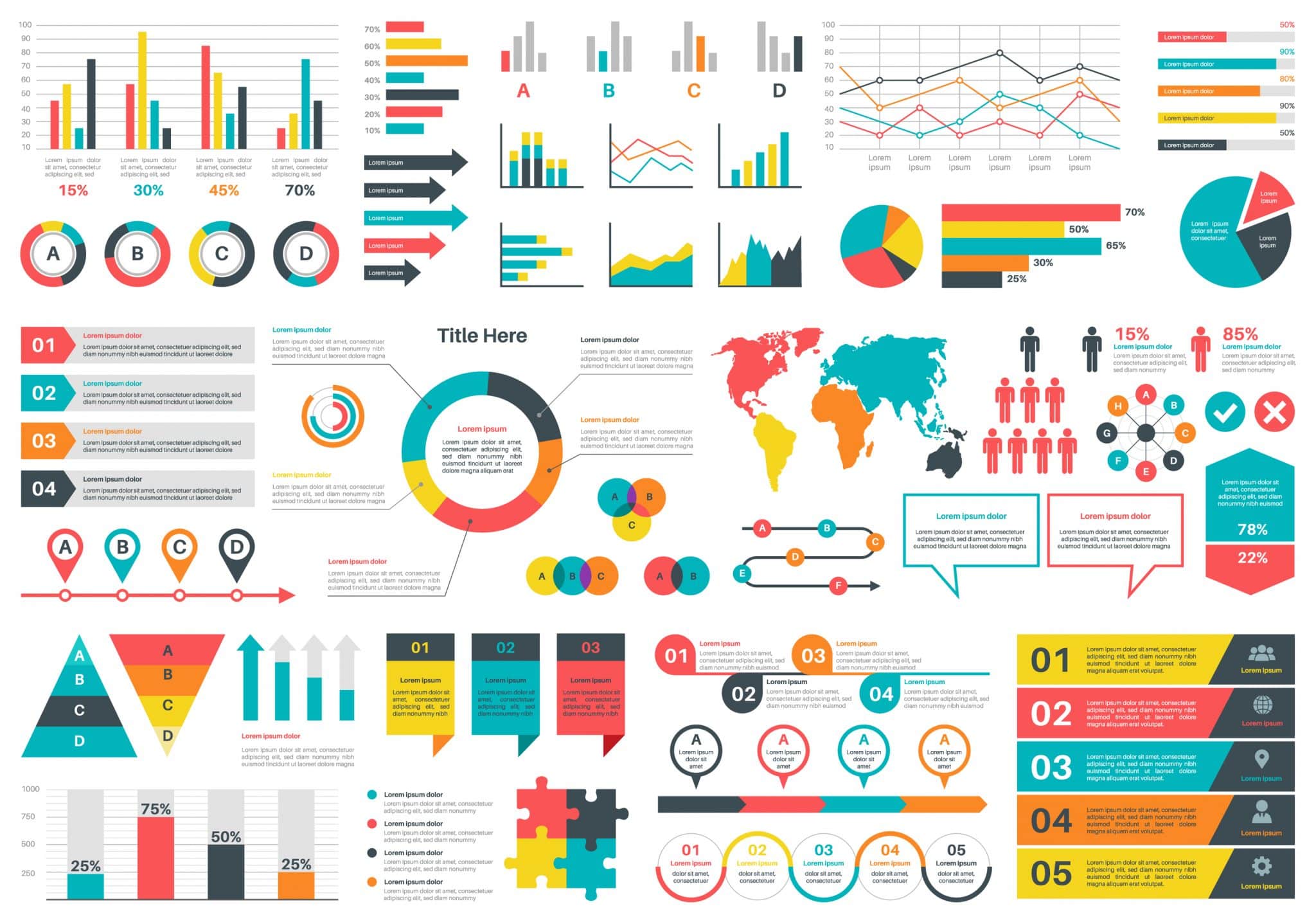
Quality infographics design is similar to having an interpreter that understands both lines of communication fluently: the language of data and the language of the human brain. It uses your valuable ideas and translates them into a visual language which circumvents the cognitive resistance that most people possess towards information-laden materials.
Great infographics don’t merely visualize information: they narrate with the help of that information. They walk the viewers through a logical explanation that makes revelations, trends and answers with only minimal study in statistics or the mind of a research scientist necessary.
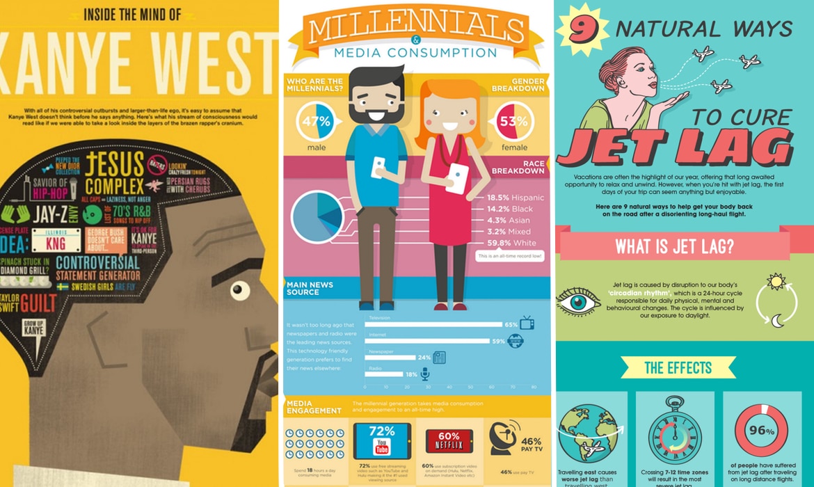
It’s an incredible transformation. The same data that causes individuals to doze off in spreadsheet form quickly becomes interesting, shareable and memorable when framed as an effective infographic. It’s like the difference between looking at a restaurant menu of its ingredients and seeing a beautifully presented dish – technically, the same thing, but a world of difference.
The Art of Visual Storytelling
It’s not merely about making charts pretty. It consists of learning an appropriate way to organize information in a hierarchical manner, visual dressing to manage information flow, and find a balance between accuracy and beauty of data.
Infographic experts know about nuances of psychology such as the way colors influence perception, which fonts provide credibility, and how white space can be used to avoid visual chaos. They understand how they can focus on the most important findings without clogging viewers with unwanted information.
And most importantly: they know that it’s not just about delivering information – it’s about fostering understanding and stimulating action. Great infographics make complex ideas feel accessible and important insights feel obvious.
The Shareability Superpower
Here’s something beautiful about well-designed infographics: they have a natural viral quality that plain text reports can only dream of achieving. People love posting stuff that looks nice and makes them look smart as well as useful to their networks.
This does not mean that your brilliantly researched ideas only reach those who know you or follow your own communication: they become the core of another person or company’s content strategy as they are shared via social media and presented in newsletters or even at conferences and meetings.
It’s as if owning your own marketing department of 24/7 workers that don’t require coffee breaks or motivational speeches.
The Competitive Visual Advantage
While your competitors are sharing their expertise through dense white papers and bullet-point presentations that make audiences reach for their phones in self-defense, you could be presenting equally valuable information in formats that people actually want to consume and share.
Skilled infographic design can get you much farther in the attention economy. In an age where everyone is struggling to gain attention and clicks, content whose only merits are its informational nature is like walking into a black-and-white film in full color.
The Bottom Line (In Beautiful, Easy-to-Understand Visuals)
Your information shouldn’t be stored in memory-killing formats. You’ve spent time and resources in developing important insights; let them not be wasted by ineffective presentation.
Ready to transform your data from spreadsheet snoozefest to visual masterpiece? Check out Workvix.com and discover what happens when your most valuable information finally gets the stunning presentation it deserves. Your audience (and your engagement metrics) will thank you.